This photo is from a website that gives tips and tricks to creating your own magazine layout. That link is: shutterstock.com/blog/master-pages-indesign-This blog post was created by Grace Fussell in January 8th, 2018. She focuses on how to use master pages in InDesign to create magazines instantly, as her blog title states. She gives different tips and tricks on how to make your magazine designs faster, easier and more effective. She also goes through the different tricks that are useful in Adobe InDesigns. This magazine layout is very sleek, and modern but also catches the readers eye with the in-depth photo on the left page.
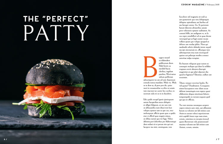
Typeface As you can see, I have circled “The Perfect Patty” which is an example of a sans serif typeface. We know this because sans are those without serifs on the ends of the strokes on each letter. The font and design of the lettering does not have any curves or edges on the word that says “The Perfect”. Although this is true, don’t be fooled by the part that says “Patty”. If you look closely, you can see that it is actually what we call an old style typeface. Oldstyles have a small curve where they meet the stem which is called bracketing. All the curved strokes have a transition from thick to thin as shown where the white line is under on the A, P, and Y in the word “Patty”.
Another typeface included in this magazine layout is called sans serif. This specific one shown in the picture above of the letter “B” has a very subtle thick/thin transition. The B has a very heavy thick and bold design and could also be identified as an old style like the other letters on the first page because of the edges on the B.
These two pages have a contrast of size in the texts. It is obvious that the B is a major contrast added to the “THe Perfect Patty” on the first page. The big B on the page grabs the reader’s attention away from the title page and the orange color also adds contrast as well.Although the “B” on the second page is about the same size as the letters in the word “Patty”, because of the color and the background change it adds a great contrast to both pages. This photo on the first page is a great example of depth of field. As you can see, the patty is the center focus and the background is not in focus nor does it have any detail or focus. The depth of field is the distance between the nearest and furthest elements in a scene that appear to be sharp. In the picture, the patty is clearly the sharp image and the focus on the page while the background is plain and lets the patty have the in depth focus.
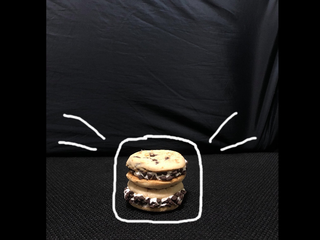
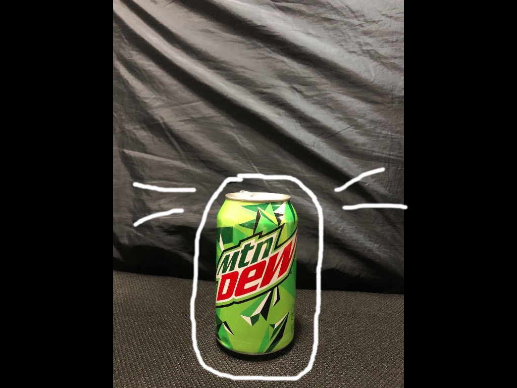
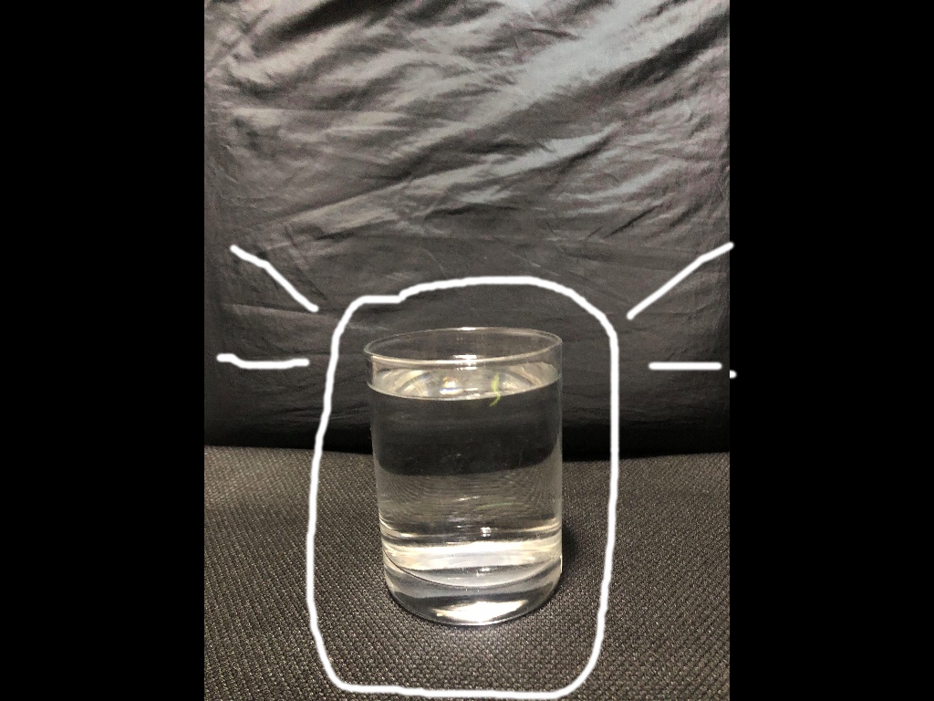
For these three photos that I took myself, I tried to mimic the overall original design by having a dark background and the main focus to be on the cookie sandwich, mountain dew, and glass of water. If the words above in the original photo were to be placed on these three photos, it would still match well with the original photo. There is space for the words on each photo that I took, therefore it is a great replica or similar photo overall to capture the depth of field from the original magazine page.