Be yourself; Everyone else is already taken.
— Oscar Wilde.
This is the first post on my new blog. I’m just getting this new blog going, so stay tuned for more. Subscribe below to get notified when I post new updates.
Be yourself; Everyone else is already taken.
— Oscar Wilde.
This is the first post on my new blog. I’m just getting this new blog going, so stay tuned for more. Subscribe below to get notified when I post new updates.

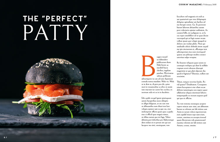


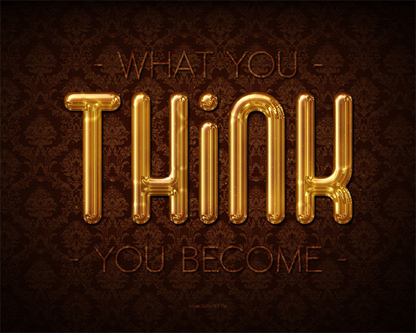
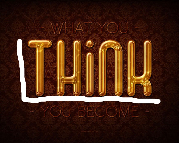
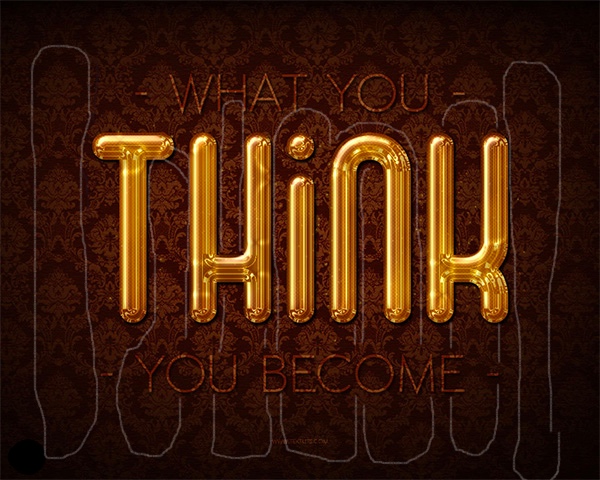
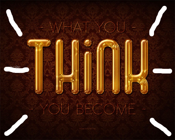
Another typeface included in this magazine layout is called sans serif. This specific one shown in the picture above of the letter “B” has a very subtle thick/thin transition. The B has a very heavy thick and bold design and could also be identified as an old style like the other letters on the first page because of the edges on the B.


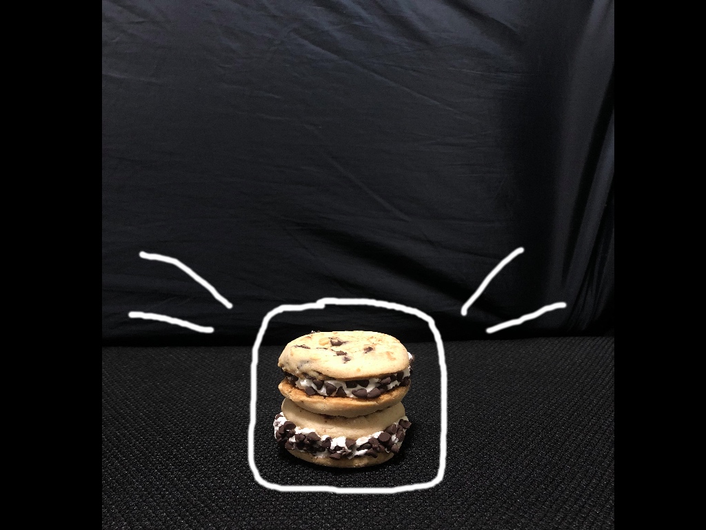
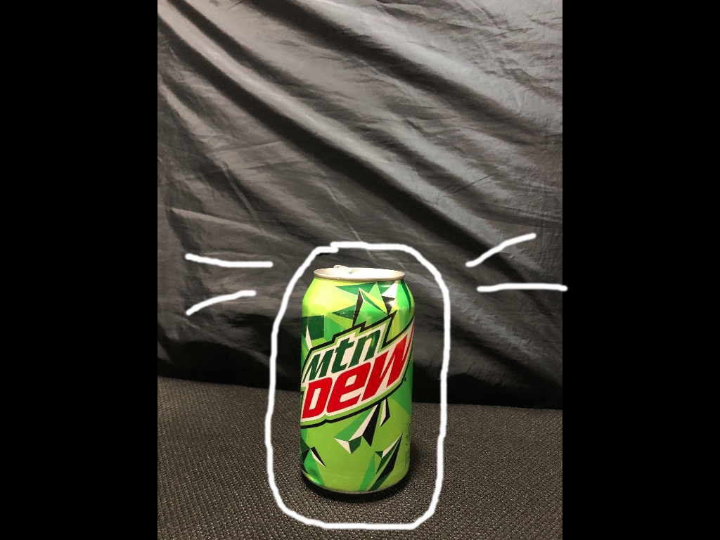
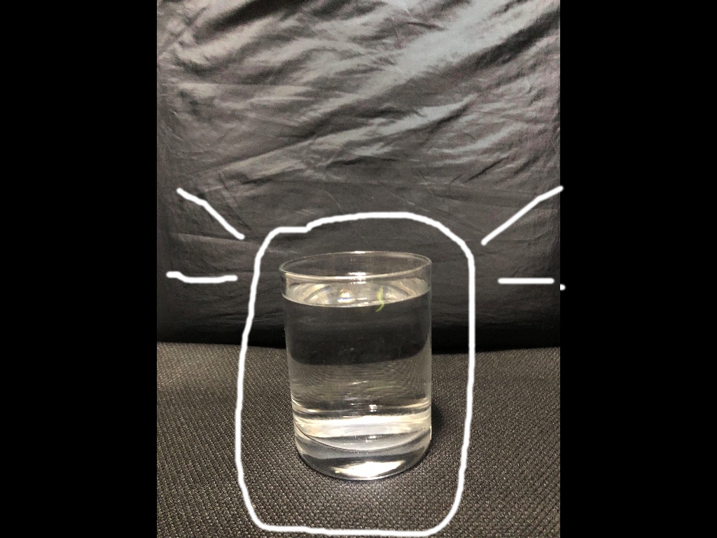
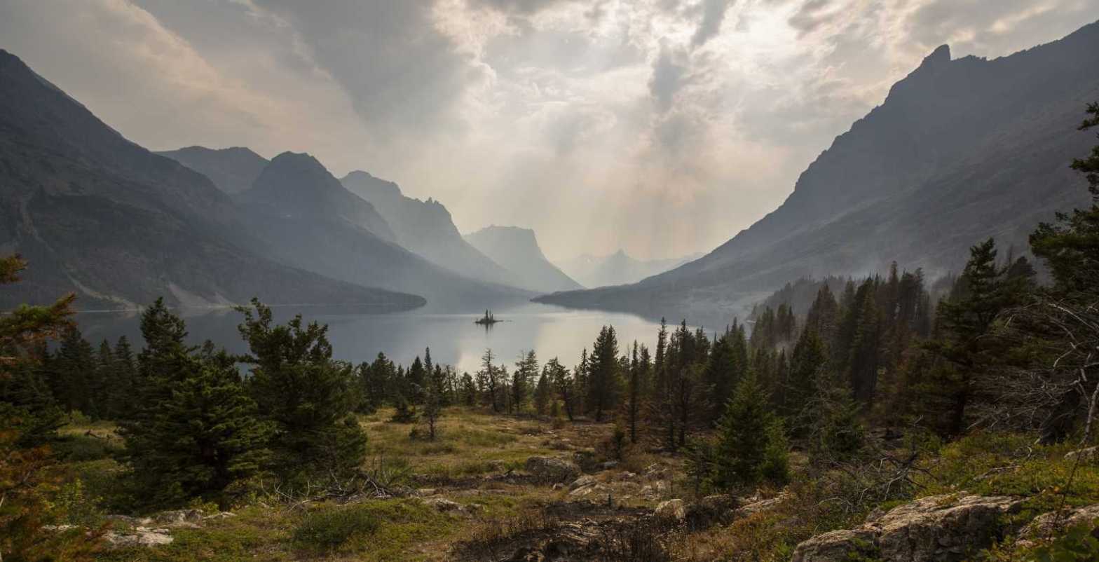
For these three photos that I took myself, I tried to mimic the overall original design by having a dark background and the main focus to be on the cookie sandwich, mountain dew, and glass of water. If the words above in the original photo were to be placed on these three photos, it would still match well with the original photo. There is space for the words on each photo that I took, therefore it is a great replica or similar photo overall to capture the depth of field from the original magazine page.
Hello, and welcome to my first ever blog post! Today I will be addressing a design from a website that actually specializes in photoshop design and creates wonderful images full of color, and principles of design including contrast, repetition, alignment, proximity, and color. The unaltered design started just in microsoft word and was then switched over to photoshop where the design came alive. The link for this design can be found at https://www.companyfolders.com/blog/55-cool-photoshop-text-effect-tutorials. This website is titled as “55 Ridiculously Cool Photoshop Text Effect Tutorials”. The companies main site name is called “Company Folders” and is a blog with tutorials on how to make cool photoshop designs. As stated in their blog, they are “the standard bearer of online folder printing delivering absolute quality infused with the design of knowledge of an advertising agency”.

This is an example post, originally published as part of Blogging University. Enroll in one of our ten programs, and start your blog right.
You’re going to publish a post today. Don’t worry about how your blog looks. Don’t worry if you haven’t given it a name yet, or you’re feeling overwhelmed. Just click the “New Post” button, and tell us why you’re here.
Why do this?
The post can be short or long, a personal intro to your life or a bloggy mission statement, a manifesto for the future or a simple outline of your the types of things you hope to publish.
To help you get started, here are a few questions:
You’re not locked into any of this; one of the wonderful things about blogs is how they constantly evolve as we learn, grow, and interact with one another — but it’s good to know where and why you started, and articulating your goals may just give you a few other post ideas.
Can’t think how to get started? Just write the first thing that pops into your head. Anne Lamott, author of a book on writing we love, says that you need to give yourself permission to write a “crappy first draft”. Anne makes a great point — just start writing, and worry about editing it later.
When you’re ready to publish, give your post three to five tags that describe your blog’s focus — writing, photography, fiction, parenting, food, cars, movies, sports, whatever. These tags will help others who care about your topics find you in the Reader. Make sure one of the tags is “zerotohero,” so other new bloggers can find you, too.
